Joseph Kendrick’s “Lascivious”, Sex or Text?
80808 Vista Studios, 808 Lady St, Columbia SC
April 2 - 13th, 2015
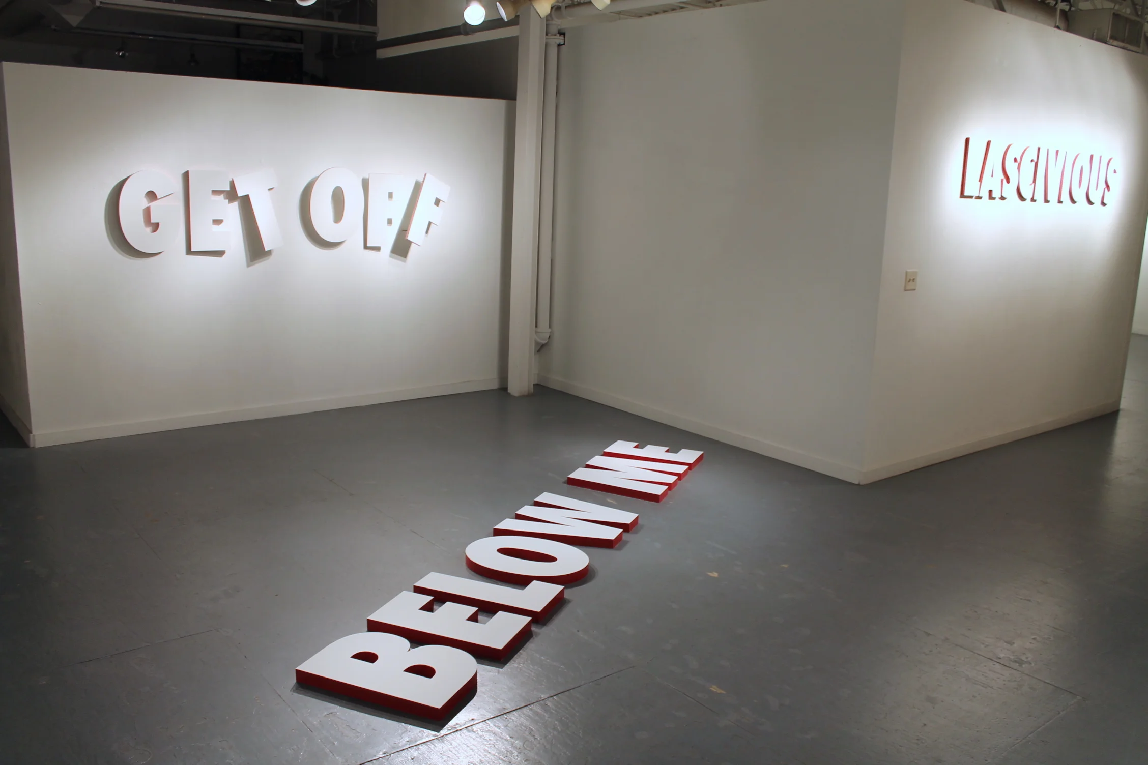
Lascivious is installed in the Vista Studios 80808 gallery, a space popular in Columbia for artists who want to self-curate, and independent of the University of South Carolina. Kendrick's description of the show is as follows: "This exhibition will present words with multiple meanings in sculptural form. Visual cues, such as - but not limited to - color, positioning, and texture will direct the viewer to alternative and evocative interpretations."
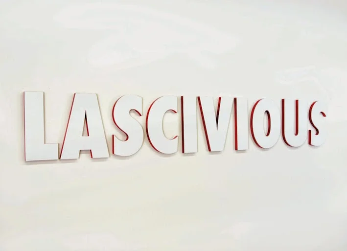
Completely innocent, and thoroughly dirty, the words the letters spell out CAN vacillate between meaning if you think about it enough, but each one is immediately suggestive, not the other way around, which suggests a success in choice. It’s the trajectory of the suggestion that created a mental space that felt pleasant, happy, adult, intellectual but not cheap, not gutter, although it could easily have fallen victim to the one liner. There is no element of a higher power separating the proverbial wheat from the initiated chaff that generally accompanies art shows, especially text based, non narrative, non representational shows - simply the adult from the child. Everyone got it. There was no discomfort, but liberation, we were all in on the joke and slightly embarrassed because sex was everywhere, suddenly out in the open, but only suggested to us through plain white letters.
Emphasizing the concept, warm, slightly neon reds and pinks color the edges of white surfaced 3-D letters, casting reflected light on the white walls. Joseph Kendrick’s MFA exhibition, “Lascivious” is in short, a lot of fun. But does art need to be more that that? I sat down with Kendrick to find out just how deep “Lascivious” goes.
Exhibition card for "Lascivious".
Transcript
It is immediately noticeable that the way you’ve arranged the the pieces works well in the space, and you didn’t use all of the walls.
Initially I was concerned that I didn’t have enough work, when I started bringing it in I realized it was the perfect amount. I don’t want anything to detract from itself or from other works.
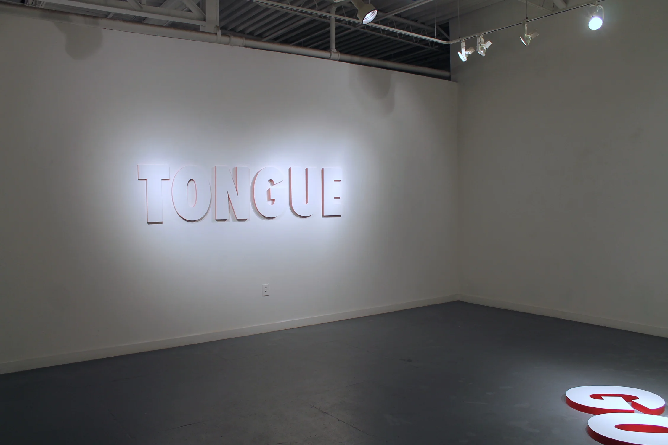
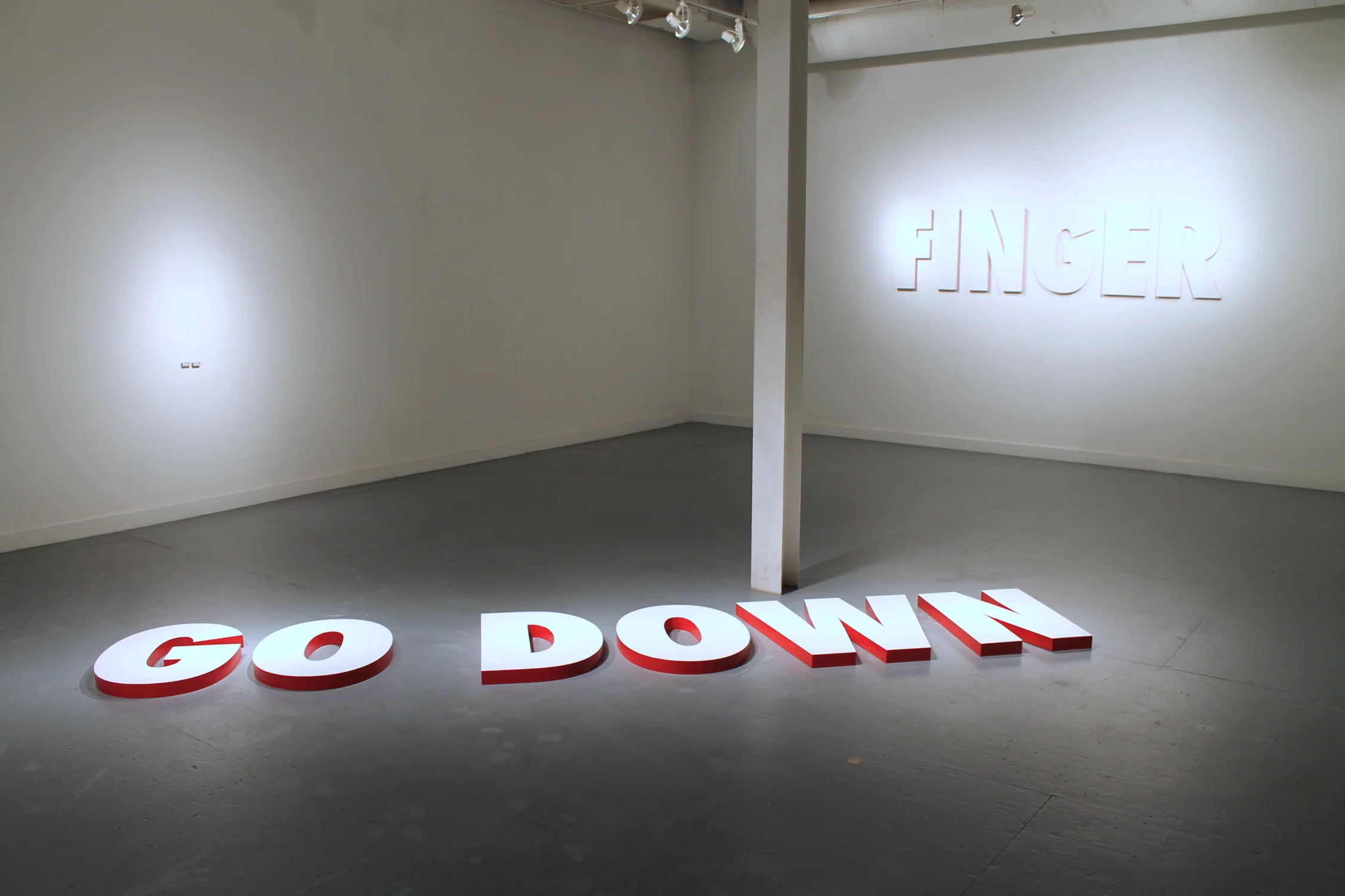
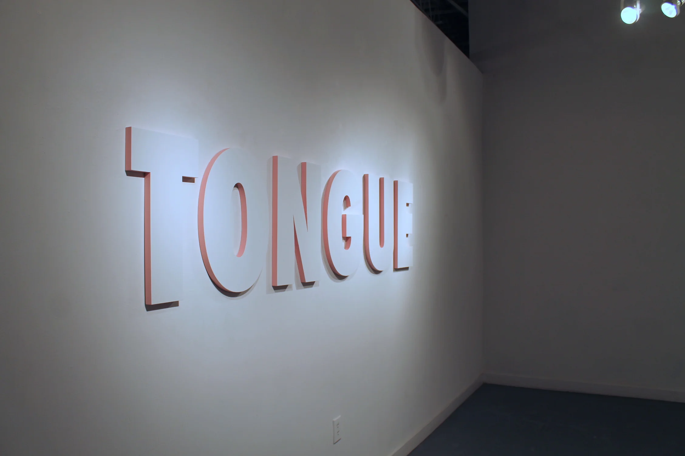
Nothing feels extraneous, the arrangement strengthens the pieces' interaction with each other. It seems appropriate and perhaps more implicit, that FINGER and TONGUE are across from each other, they have a magnetic relationship across the space and they act the same way.
That is very true. These two are colored a similar way with the same pink border, and they function the same way, so when looking at it, we question, are we talking about the noun, or are we talking about the verb? Initially with these two, I was concerned that they would be too matchy-matchy, but I think they strengthen each other across the room.
I think so too, yes, I think if you had FINGER out there somewhere in the other room it would be less effective, since these are related as objects, as well as actions. You have ERECT on it’s own, with it's action it works alone and as a part of the whole.
What did you think about the way children walked on the pieces?
Well you know, if you put something on the floor, you have to expect things to happen. I’m surprised no one tripped on them, they haven’t been kicked or moved around, at least yet. I’ve already come in and rolled new paint.
Can you talk about this piece, what is it called?
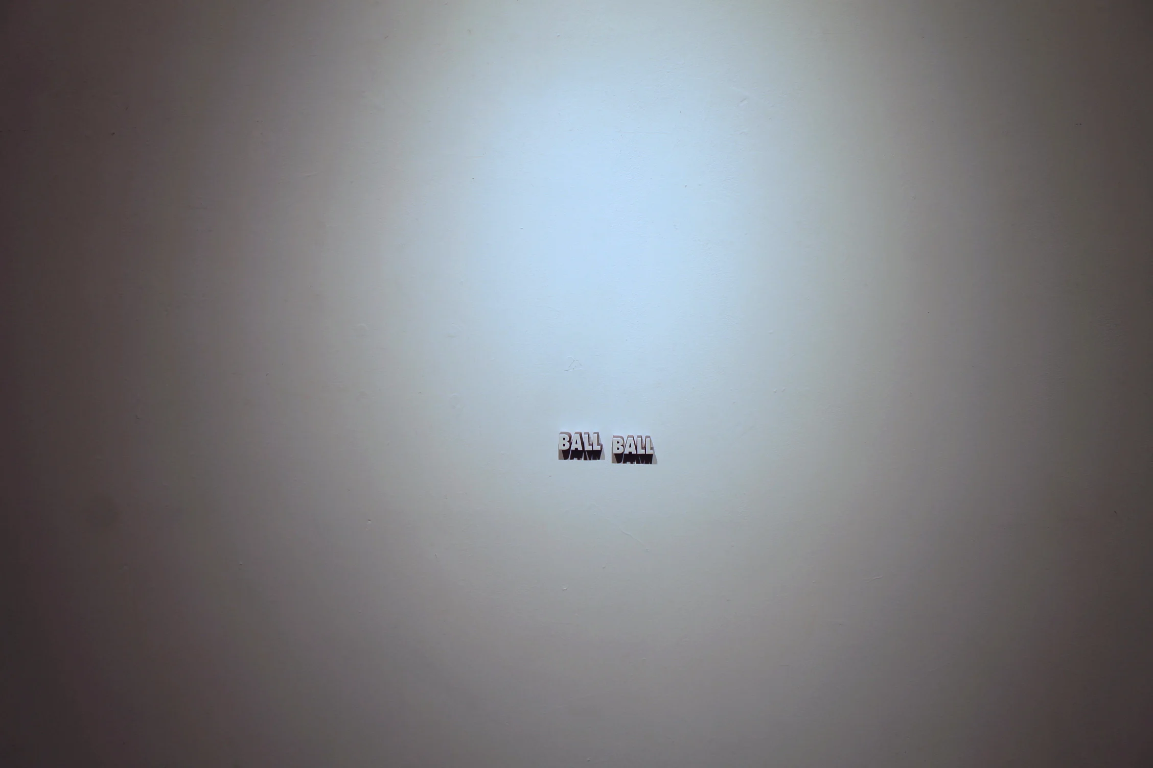
With all my work, the title is what you see, in writing too, I capitalize, put them in all cap's, this is BALL BALL. If I titled it Balls, then it would. .
Be overt?
Yeah, have that straight meaning, I ride that line of vague obscurity.
That’s the whole point, the duality of it. Something that made it very clear - is that kids came in, and to see children come in with their parents, and the parents, you would see this dawning on their faces, this awakening, like they’d see this giant word TONGUE, or FINGER or whatever and they would look at their kids, like a bit horrified, but their kids don’t know.
Yeah, they have no idea.
laughter
It illustrates this division between an adult and a child, they see BALL BALL, that’s not going to mean anything.
Right, right.
That was pretty interesting, because you, the viewer, brings it to it, otherwise they are just words.
The thing about this, because it’s so much smaller than the others, I put it on the biggest wall in the entire space. I wanted it to highlight it, but at the same time, it only works if you notice it. I know for certain already, some students came in, walked through quickly for extra credit, they didn't notice it, but when you do notice it, it is a much more powerful experience. Some people say this is their favorite.
Yes, I think this is one people wanted to buy.
Laughter
I think it would need a big space like that, you know, the juxtaposition between the scale of the piece and the area it inhabits is necessary.
Well see, that’s the interesting thing about that, where I’m at, I don’t think I could sell any of these, does that make sense? Because then how would I get any future shows?
So you need to keep them together as a body of work that you move forward with?
I would evolve the body, yes, but the idea is for the rest of the duration of the show, I’ll come in and make some nice drawings.
Photographs of them would be interesting. What if you replicated some, because you could?
I certainly could, it’s just that with these, because I made them all by hand, it’s more labor than I would probably want to get into, I mean if someone wanted to buy one, we would certainly talk about it.
They would loan it if you wanted to show it again.
That all comes down to contracts, ownership, all those things.
Yeah, it’s interesting when I first came in, I remember I walked in, and I knew your work kind of already but I had never seen it really, I had seen LASCIVIOUS from the card, but I had never interacted with it. I think that part of the work is the interaction in the space, it’s a huge element, you don’t have it without that. I came in and went to this one and just laughed, it was a really fun experience, and I was engaged but I didn’t come up and inspect the edges, all that stuff you sometimes do with an image.
Well it’s an interesting thing, to bring it back to the ownership, not too many people are going to want an 8ft word hanging on their wall. Apart from that, not too many people are going to have the lighting to do it, I consider the lighting a part of the work, I consider the space a part of the work. There was a moment where I had a dust mop, and I was sweeping, actually twice before the reception, and I was telling myself, kind of laughing, you know, if craft is care, I’m crafting the space, because I don’t want dirt, I don’t want these things to be seen.
Right.
Which is funny, in a minimalist aesthetic, you work so hard for things that you won’t see.
Right, I think we could go way deeper into that. It’s interesting that it is very site specific, so if it were in a different space, it would be a different layout.
Lets walk to other room
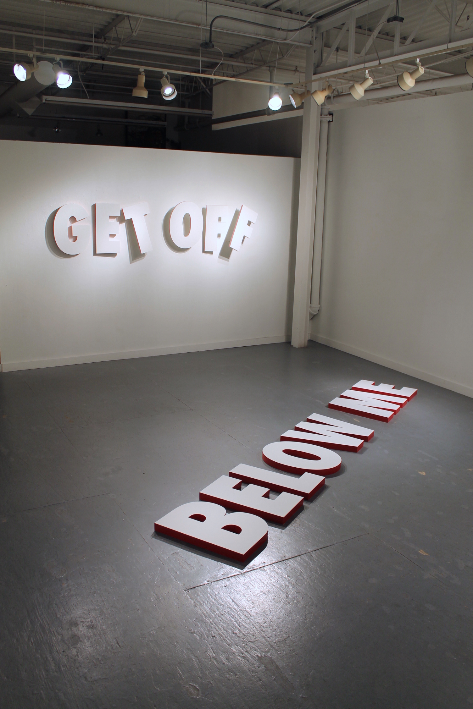
Do you have anything you’d like to say about GO DOWN while we’re right here?
Well, I mean, I guess to expand conceptually, when you stand over it, and you look down, you read "go down", it comes across as more of a command,
Yes, because you’re physically looking down, and it says go down, so you’re in this sort of action.
Yes, and so your body is in that position of commanding someone to go down on you, right?
Sure.
And it’s partner piece, in the other room, BELOW ME, operates in the same way. I have trouble considering whether these works are gendered or not. Because GO DOWN, presumably, a man or a woman can say those things, but BELOW ME is pretty specifically male. But regardless, I chose that color red to be more of a commanding color, it’s a command once you say it.
It’s like part of what you were saying about the minimalist aesthetic, because there aren’t a lot of elements, each one has to work together to say something.
Right.
And if they don’t, it doesn’t work as well. That’s something that is really nice about the show, it really feels like it is super considered.
So, like you were saying, you were talking about the gender, can you talk a little bit about the idea of sex that’s behind basically the whole show?
It’s a theme for this work, I don’t feel that it is the overarching goal of the work. I guess that is the part that comes from my personal interest. I research the double entendre and how much or how little we have to do or say to convey or accept alternative meaning, that’s what I research, but I also feel like I have a natural proclivity for dirty jokes.
Laughter
I mean, those ideas come much more quickly and often for me.
Yes, you walk in, there is this element of dawning realization and everybody gets it. There’s this element of being in a gallery, at an art show, and a lot of times when you walk into an art show everyone is quiet and walking around and everyone looks and they read the card and so on. This was nothing like that, you walk in and if you’re an adult you’re in on the joke, so everybody gets it, A, and you feel kind of liberated because you’re free, you know you’re all thinking that way and you’re free to think that way, but at the same time there’s this level of intelligence about how the work is presented, there’s this "gotcha", so there isn’t just this one and done thing either, there’s more to it than that.
I really appreciated the fact that at the reception there were several people that I knew personally that had never seen my work. There’s a receptionist that works at the arts commission, she’s pushing 80, she actually made the chocolate covered strawberries, and there’s the HR person, they came together, and when they first came in, they asked how I was going and wanted to ask questions about color and they are so well crafted, and
Dancing around
Yeah, it was all about the formal elements of the work, but then, naturally I bounced around and talked with other people, and as they were leaving, they said it was a great time Joe, shook my hand, and then she said, I’m so glad I came, pun intended, and they they both just started dying laughing.
That’s great.
Yeah, so there was this sense of validation, I provided this environment that allows people to accept this part of their lives. We all know everyone has these thoughts, sometimes they’re funny, sometimes they’re serious but it’s ok to allow yourself that.
You don’t tell us what to think really, it’s up to us. I remember there may have been people who came in and left, like it wasn’t their thing, but in general it was a fun time for everybody.
That’s part of the allure of using text or being a text artist, is that through words I can be as explicit or as vague as I need to be, so then I don't immediately turn people off, they at least read it, if they can take time to read it, they can take time to accept the experience, and it’s not like a graphic sex scene or something like that, that people might see and turn around and leave.
Yes, there’s something very different about being a viewer and seeing an image, like a traditional sort of image and coming up and you inspect and what do you get from it, it kind of turns the experience of looking, it changes that, text art I guess, even numbers is different. You saw it, you had a realization then you kind of laughed at yourself.
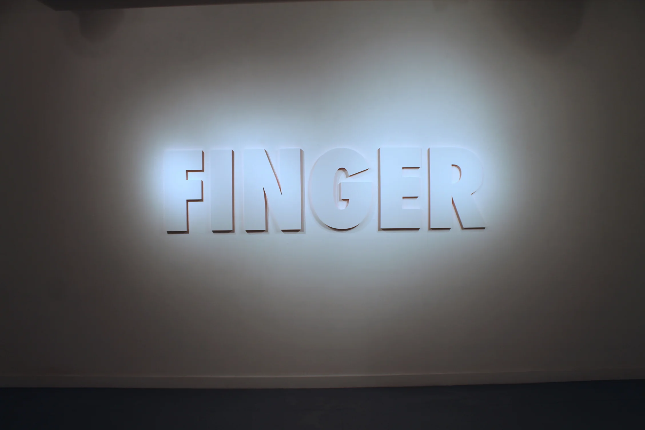
That’s part of it too, it’s like just by using these subtle visual cues, it’s like, I never mentioned for example FINGER as the verb, that’s something you’ve heard in the past and you’ve conjured in your own mind, you know what I mean?
Yes, well what’s nice is there’s this great amount of lightness, like I was saying before, it’s balanced by the way it’s not overt and how well it’s presented and how well you used the space, and the way that it’s hung.
Laughter
And that started happening, everybody started saying stuff, everyone started talking about it, and that doesn’t happen very often, and that was really refreshing. You didn’t just put words up, they’re all treated individually as pieces, and the way that they’re presented has to to do with the work.
I have a master list of words, jokes, whatever you call it, those are works you explore, and in putting together this exhibition, I have another list of words that I started to make but then they didn’t necessarily fit in this theme and they started to say other things or operate differently, so you’re right, they do very much work together, but then they also work on an individual level as well. I had to make sure to cultivate that in a very particular way.
The choosing of the words.
Exactly.
Can you talk about why they’re white, on white walls a little bit?
Yeah, I have a modernist sensibility, it’s like you said, I try to plan out everything, and in doing that I strip away any extraneous information, and so the white on white is the only small metaphoric bit of the whole thing. When you look at a white wall, it’s plain, but when you see a subtle indication of something, you think, am I actually seeing that, or am I just thinking it. So, it’s a metaphor for thought, if you have to place it in something.
It may be some other things as well, you don’t write white on white, it’s not like text on a page.
Right, that’s a really good point.
That goes to thought, like you’re saying, it’s more like an imagined space. If it were black it would be different, if it weren’t white then the color you use around the edges wouldn’t glow in the same way.
Right, that’s true too. People seem to be really receptive to that.
But it suggests, it’s funny, like you were saying, the red on white suggests, its like a command, and it’s just space (dimensional) too, but especially in the pink too it suggests neon
Right
So it’s kind of like neon signs, but they’re white, so it’s separated from that.
I love that
On one hand it’s like super dirty, like so dirty, and on the other it’s not at all
Laughter
you know, you could say it’s just not all, that’s the division.
Can you talk about LASCIVIOUS?
Certainly - that in a way works as the marquee for the show, but it’s placement, again, was very deliberate that it’s not the first thing you see, so if you come in through the front door, the first thing you encounter is the first gallery space, or the first room. Once you walk through there, then you come out and see LASCIVIOUS in the connecting hallway space. So if you had to wonder what’s this about, LASCIVIOUS, you see it and you know, it’s dirty.
It’s like when you move someone through a painting and you use cues, visual cues. Also there was something I was thinking about you were saying about text, you are using text so it’s not overt, so it’s not - it’s funny, I left writing for painting because I felt like writing was so black and white, I was attracted to the possibility of ambiguity in painting,
laughter
so this is, but for me at the time maybe it was, but this is really nice for me to hear that and see this, it comes around.
There’s something to be said about that, you use the expression, “move your eye through the painting” and so if I’m viewing the world as it is, in a very real way, I’m moving my eye through the space. Then even more so, my body through the space.
Yes, in three dimensions.
Yes, it’s a fun thing.
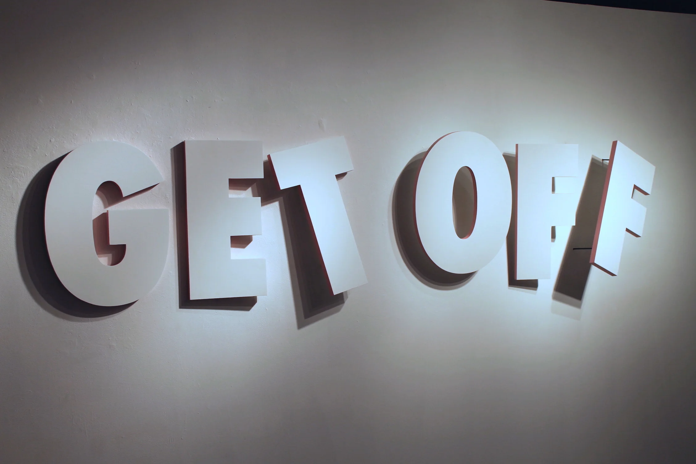
Can we talk about GET OFF?
A lot of people really liked this one because it comes out into the space at you, you share the space with it. The color choice was a big point, I chose the pink because I wanted it to be more subtle. Again, it’s much more in tune to sexual organs, and I didn’t want it to be red because then it becomes much more of a warning, you know a warning red, like "Get off!"
Like the others (BELOW ME and GO DOWN)
But as it is, each letter is successively coming more and more off the wall and out of arrangement, it becomes more explosive, more playful
A slower build?
exactly, and so much more like, an orgasm.
Does the pink gradate?
No, and I actually thought about that, but I didn’t have that chance to explore that.
Do you have any ideas for future shows after doing this one?
Yes, I do, I mentioned before that I was worried that the show was getting too matchy-matchy, which is such a cute, ridiculous expression. FINGER and TONGUE, they’re probably the most subtle two in the show, and since that they offer the baseline for the entire show. If I had an entire show of works functioning in a similar way, I feel like that would then be the theme. When I say similar way, the whole "are we talking about a verb or a noun function".
Right
Have you ever done work that wasn’t about sex?
Well, you know. . . laughter
I mean that ’s an odd questions because when I came into grad school I was doing these odd assemblage sculptures and I would present them and people would start scratching their heads and I would start talking, start talking about the works, and I would go on and on about my whole life history, it was all very self expressive,
Right
and so then, people were like Oh, now that we have the story, we have this other appreciation for it, so I learned that that’s probably not the best way to make art
Laughter
Sometimes you have to move past that initial personal stuff, there's the thing that drives you and you want to say things, but you want to approach it in an intelligent way, where you have some kind of purpose. It reminds me of the Tarkovsky quote, "Never try to convey your idea to the audience - it is a thankless and senseless task. Show them life, and they'll find within themselves the means to assess and appreciate it".
Well, so, in coming to that realization, I was like, the best way for me to tell somebody something is just to tell them. So then again it was found object, assemblage work, so I had these letters, and I rearranged them and started spelling “dirty words” and a lot of that came from my interest too, again when I was coming into graduate school I had broken up with a longtime girlfriend, I was dating a lot, I mean, I had a lot of this on my mind, I didn’t have a narrow thesis research subject.
Something outside of yourself that connected with other people?
Right.
So is that the story that had gone with those assemblages that people heard and said Oh, now we have something to base these off of?
Yes.
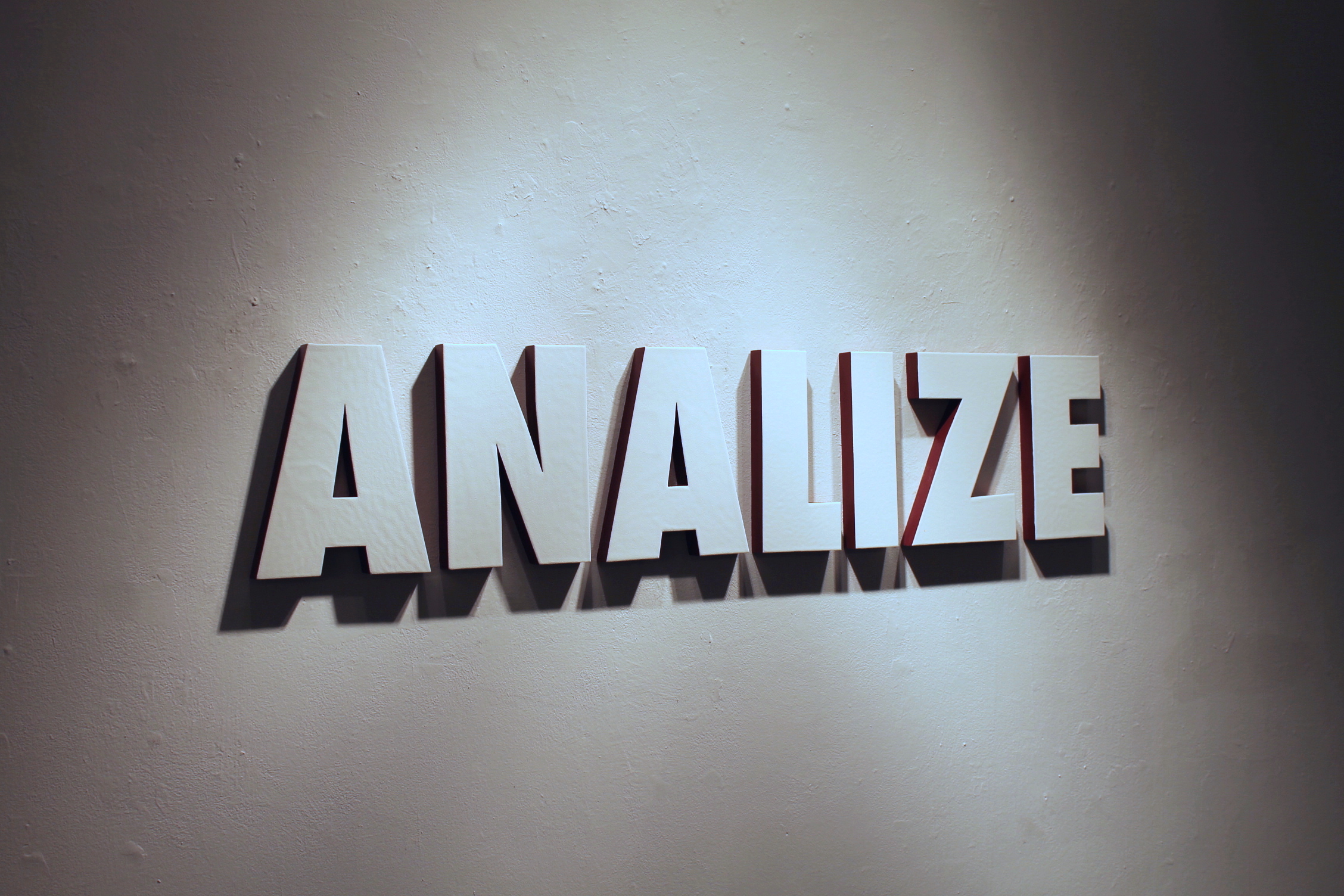
I wanted to ask you about this piece specifically, ANALIZE
Well, I call it ANALIZE, (pronounced "analyze") and I was asked if it was a problem that I made up a word, you know what I mean?
Yes
In this body of work, this is the first one that I, I don’t want to say I necessarily made it up, but I manipulated the spelling, so analyze is a-n-a-l-y-z-e and I substituted the “y” for an “i”. Now, if you understand the suffix “ize” ize, it means to act upon or work against, and ha so with that juxtaposition, you say analize which means, you know, I guess a made up definition would be to act upon or work against anally, which therefore brings about all these other sexual connotations.
And the relationship to the actual word "analyze" in that context?
Yes, you might have to think a little harder to get there. A lot of people, and this is what I was banking on too, a lot of people didn’t even notice the misspelling, this was a question mark for a lot of people, but through conversation with myself or others that they were with, again, I think it had a much stronger impact, that experience of working through to get that meaning.
There’s different levels of the amount of time (of understanding) the slow read
Exactly. In a way the whole show kind of feels like a crossword puzzle, some of them you’re going to get right away because of your own personal experience, right? And then that will lead you to other clues and more meaning which will help you understand the others. I guess there are some formal aspects of this too, it’s not the smallest piece in the exhibition, but it’s smaller than most, you know, and anus is smaller than other sexual orifices, it’s a much darker color, it’s almost like a garnet, which I think lends itself to the, you know, this is dirty, this is real, what’s another word - overly evocative?
Well in contrast to the pink too, you have the pink, which is not so dark in a suggestive sense,
Right, I also like to bring up the point of sexuality, sexuality is not like a light switch, you’re not a pervert or a prude, you know, it’s much more like a spectrum, Freud, after you get over wanting to fuck your mother and all that shit, then he talked about the concept of polymorphous perversity, sexuality is a spectrum, so just because you like to be choked a little bit doesn’t mean you don’t like to make love as well. Everybody falls along that spectrum.
I think this one for some people, they realize something is wrong, I think that ANAL jumps out and they may not totally understand the IZE and what that means, but you feel it,
Right
you get that, you know that something is a little bit off whether you realize immediately that it’s spelled wrong or not, but anal is emphasized somehow with the Y not being there. You want to talk about size a little bit?
Yeah, I think size is also connected to the font, a lot of people ask me about the font, I use Futura extra bold, it lends itself to the history of text artists, Jenny Holzer uses this, Barbara Kruger uses this, and it’s in all caps, it’s very much a statement. And so the size too, most are larger than human scale, at least 8 ft or 12 ft in size, and that’s just associating itself to human scale, you know something bigger than you is more important you know?
It’s a very Greek thing, the idea of scale. Seeing the oversized Greek gods and stuff, it was a statement about their relationship to the viewer, I remember being in the museum in Athens for the first time, walking around, and you see these statues in history books and it’s different, then you go in and see it in person, and all of a sudden you’re face to face with a work of art that has quite a presence, and it’s partly because of the size of it. Also they are placed at like, ball level, you go through that place, it’s kind of like your piece in there BALL BALL, like you’re just at like crotch level of all these things and it emphasizes the fact that you’re below.
Laughter
Right, you’re subservient.
Well, BALL BALL is the smallest piece
That is true, and it’s lower than waist level, which is kind of a flip of the sensation that you're talking about
Yes, yes it is,
But because it’s smaller than all the others, you have to notice it, and once you notice it, the hope for me is that you move in to explore it, and then ultimately you realize that you’re in a very precarious position, you know, you’re bent over, squinting at what represents testicles.
Right, I think it also makes you kind of genital aware, because it’s just about genital level, I thought that was also a part, one was a little lower than the other
Yeah oh yeah, it’s very much implied and that’s also the only one that has two colors to it, there’s a light blue and very distinct pink and light blue that coalesce, it’s such a subtle mixture, it’s not purple, but it’s very distinct, so a lot of people get the joke that it’s blue balls.
Yes, it is funny to ask your viewers to think about genitals. So then you’re walking around thinking about that, it adds to that whole - you know, people didn’t need to be drinking to feel loose at this.

Let’s talk about ERECT
In a lot of ways ERECT was the first one I did, which kind of led me to this overarching research subject, and since then there have been four or five different idea permutations. One was that I was going to build or construct the words so that they would have this framework as though it were being
like an erector set?
Erected, yeah exactly, yeah, like a building. But then as I was cutting up the words, much like the others, that aesthetic style, then I was thinking maybe I could stack the words on top of each other, I ran into material concerns, like if it were to tip over would it break,
or hurt someone
yes, so and then well maybe then I can hang them from the ceiling, but then if it’s hanging then it’s not really a structure anymore. Anyway, so ERECT with the implied glowing red and in this sense and in this particular piece, it’s moved left justified, you see the word "erect" and then you have all this extra space to the right that leads you to think of the word erection, and I actually lit that side of the wall as well, but then again, I’m not the one presenting the word erection to you, you come to that conclusion yourself.
And also, that is the conceptual idea of an erection too, it grows
Right
So you’ve given the apparatus word, erect, and then it becomes erect - erection - mentally, it embodies it’s own concept and becomes self referential.
Self illuminating, there was even another idea where the E would start out on the floor and the letters would start standing up until the T would be on the wall and that’s another pragmatic concern, time constraint, how much did I really have to spend experimenting on this piece.
Yes, this arrangement worked.
It’s the one that kind of started it all, I feel like I could keep going, I use this one as a model - ok, the more ideas I could come up with just this one word, there’s got to be something else with this word, and this word, etc.
Are you interested in making the puzzles more difficult?
Maybe difficult is a good word to describe it, I don’t want to make them any more ambiguous, because there’s only so long that someone is going to work to get it
That’s a good point
Something that goes back to the curating part of the whole thing. So, a 101 joke book, you read the first few and they’re actually funny, and then they're all the same and by the time you get to 101 you’re sick of them. There’s always that concern for me, of course I’m not having a 40 year retrospective, i’m not there yet, but
You don’t want it to get boring
Yeah, I don’t want it to get boring, and I always, right now with my work, I’m always worried about group shows, just seeing one piece out of context, especially with all these other things, are you liable to get it, and if you don’t get it, is that a problem, and that hearkens back to the complicated manner of the whole thing.
With them being site specific, is it more important for you to come up with the ideas or to have a space to work off of?
I would say with these specific ideas, I would take a word or phrase that I felt kind of lent itself to the work, I mentioned my master list earlier and I think site specific might be a little too restrictive as far as a description for the work, I’ll have wall pieces and floor pieces, maybe it’s space specific, so if I make a work that is specifically to go onto a floor, maybe it could be adapted to go on any other floor, same for a wall, maybe outside on a wall, maybe on a roof, maybe in space.
How do you find your words?
Just in conversation, I’m constantly texting myself, transferring that to the master list, I go through, pick which ones hit me that day. I had initially thought just days before getting into the space, I was looking at the layout, they give you a map, I thought REAR ENTRY right here next to the back door, would be just the most beautiful thing I’ve ever made, just the word REAR ENTRY and how that just works but it’s key to have that back door in proximity. There’s no one way that I could say I have chosen this word, it’s going to go in this space, it doesn’t ever feel like that. There’s a sense of organization but then there’s also a sense of organic spontaneity, like how am I going to present this this time.
Do you think the work would be as effective if innuendo weren’t the subject? If you weren’t riding on the coattails of sex a little bit, if it were less of an “exciting” topic?
I understand that, exciting? Like I said, I mentioned it earlier, I feel that I have a certain proclivity to think this way and so I find it enjoyable, I don’t want to call it sensationalized, but that’s a real thing, people pay attention when you’re talking about sex.
And we bring it, that’s the nice thing is that you’re not completely bringing it
I’m facilitating it
You’re facilitating it, we bring it, and that’s the nice thing, we’re not hit over the head, we’re not walking into a show that we know is about sex at all.
Right.
I think that’s effective.
There were some concerns that I didn’t advertise the show so much, and then some people told me that they saw it several places, but the card, the advertisement for it was very vague, even to the point where I’m not 100 percent sure people knew they were walking into a sculpture show
It could have just been an image of a title.
Right, and that’s the beautiful thing for me, I love the fact that I get to tell people that the card was actually a photograph, it wasn’t graphic design.
Do you like having the jump on people?
That’s fun, that’s part of the experience, I think people appreciate it.
I think they do. Do you think it’s more about sex or text?
It’s more about the text, which is a good question, because I think when I was practicing my soundbites, what’s this work about, when I’m installing, people walking through, asking about it, when you’re not prepared or not wanting to talk about it, is probably the best time because then you work out how do you talk about the work. There was one person in particular that kept saying this work is about sex, and I think that’s a gross oversimplification of it, sure it has that undertone, that thematic undertone, but ultimately it’s more about the text. It’s much more about that interpretation of words, how much do we have to say or do to accept or convey an alternate meaning.
And the tension between the text as object and it’s inherent linguistic duality as a verb or a noun?
Yes, again, I facilitate, it goes back to that modernist sensibility, I have a certain amount of control, I do want to guide you in a certain direction, but a viewer of my work brings plenty, it’s not just me.
I kept thinking it was a garden of eden kind of situation because you eat the apple, it’s like Adam and Eve are in the garden, they don’t know they’re naked, they don’t know anything and the snake is like you eat the apple - children would come in and they have no idea and the parents were immediately afraid, I kept thinking about that, the parents were so afraid their kids were going to be aware, and they’re not aware, because they’re kids, and that’s the difference between.
There’s something to be said about cultural conditioning, I get that too, my work is heavy on that, it’s heavily reliant on that, you may, I may take this work to England or Germany or any other country where a mass population speaks english but they may or may not get it, because they don’t use the language in the same way
Right.
There was actually a man from India who told me that I met at the reception, he told me that he spoke four languages and he told me that he thought the show was hilarious, he told me that english is the dirtiest language because we simplify things, we say oh it, do it. If I’m 32 now, I’m 32 now, so 12 years ago I took Spanish three times, we just needed it twice, I failed one and take it again, I kept, since working on this work, I keep thinking about a conjugation of a verb that is pronounced puusey, I have no idea what the word is but I keep going back to that, it’s not pussy but it sounds like it.
You never forget links like that, it ties you to an experience, it reminds me a bit of Balthus paintings, because in a certain sense there is an argument that the paintings are dirty because you bring it to it.
He did it intentionally.
I think he was doing things on a number of levels and he was exploring other things that if you give it a chance and go a little deeper those things are there, you’ll be rewarded. In one sense it culls some people out who aren’t going to look deeper than the surface that they bring.
Do you know John Curran's work? He has explicit work but he is known for the exaggeration of the figure, this is a naked woman but she is sexualized with triple D breasts, smiling,
The gay couple making pasta.
It has that explicit content but it’s nothing that makes it explicit,
The thing in Balthus is that sometimes there’s nothing explicit in it, a child would look at it and not see that. Sometimes it’s more about being a child and how when you are a child,
I see what you’re saying, you remember that time when that didn't mean that.
I think it’s really interesting because there’s so much more in the paintings past that stuff.
To continue that thought, there are artists that inspire me, I’m finally getting to where I’m comfortable saying I’m a text based sculptor, I’m an artist first and I happen to work in text and I make text in sculptural form
So you do see yourself as a text based artists?
Yes, I can seriously visualize this as being a career, this is my career work. Also, this is something I’ve very excited about it, I can see myself being excited for a very long time. Some of my favorite artists have nothing to do with text.
Who are your favorite artists?
My favorite artist of all time is Richard Serra, which you may think that is cliche but it’s one of those things where to see the work in an image or in a magazine and then to see it in person, to experience it in person, you kind of get mad, when you really get those sensations moving through the space, you get mad at him for coming up with something so profound. He’s tops on my list every time, plus career plus writing, intelligence.
I can see an affinity, there’s the element of complete consideration of every element.
Absolutely
of the space and in your work too
Absolutely, if you ever listen to an interview with him, you immediately know that he has thought of everything, he barely allows the interviewer to finish their question or comment before coming right back in, he knows the answer already, I think that comes from what you’re talking about, the consideration for everything, you just keep thinking why, why this, why not this?
Do you think the experience is too controlled?
For Richard Serra? Maybe not too controlled because at some point you have to look at 40 or 50 years of work, there might be some overlap or things that you can probably tell need a little more refinement, I would say one of my biggest critiques of him is that in all his years of making sculpture, he’s done two or three monuments and they make no sense, in the sense that it’s just work that he’s dedicated, I don’t understand how his work is a memorial to the holocaust or a couple other things, it seems misplaced outside of the academic understanding that he’s always asking those questions. So here’s a work I’ve made as a monument and there’s absolutely nothing different conceptually from the rest of my work.
Like the way Kiefer’s work completely works as a monument to a culture
His entire career is meant as such, that makes sense, thats the opposite intrigue. If he was to start to make cartoons or something that had nothing to do with the German identity or the holocaust, it would be pretty odd.
I really appreciate the way it works (text based art)
You could argue a lot of it stems from conceptualist Joseph kiasou, Hubler, Lawrence Weiner, Robert barry, these guys were addressing different ideas and concepts but a lot of it is only approachable through text, it’s hard to see air you know, they released a colorless gas into the world, the atmosphere, and that was the title of the piece, - you see what i’m saying, the only way to describe that piece was through text, you can have the performance, but there’s not much documentation to it
It becomes documentation.
Exactly, Lawrence Weiner considers himself a sculptor but he may argue with you whether he ever sold a sculpture or not. The idea is that he calls his dealer or his lawyer, more appropriately , and they write a receipt for a purchase of a work, and that;s the only transaction that the buyer ever gets, and then it’s up to the buyer whether he wants to present the work as a sculpture or as a painting on a wall, whatever, naturally because of his career there’ve been some aesthetic similarities that just kind of happened, but he;s never had any control of that, which I find incredibly fascinating.
It is fascinating.
He talks about language is the sculpture material, that’s like the next, step,
Like poetry, where it happens in your mind.
Exactly
So this is more, it’s not just, you’re considering the object in your work here but it’s also about what happens in that mental space based off what you’ve done to the object, because it’s object and text.
I’m not ready to go as far as Weiner does and let go of everything, I still believe in the power of objects or the power of an experience. that’s where I am.
Like Richard Serra, the power of the experience, he’s not text but that is very much about you walking through and the relationship between yourself and the object and the object and space.
He’s said before that they didn’t have to be made out of metal, he just knew metal, he was comfortable with metal.
They seem slower paced too,
In experiencing that work, you don’t get over the fact that they’re made out of metal.
That has to be a part, it’s big, heavy, it has connotations.
But my work, I don’t necessarily feel it has to be made out of wood or MDF, these works I made by hand, which is incredibly laborious.
That’s interesting that they’re a super craft but at the same time craft is a huge part of it, they belie that.
I joke that a monkey could do this, of course I’m joking, a monkey could do this but a machine could do it much better. In the future I hope to have more and better resources, a cmc router and those type of things, then for me it’s much more about the idea.
So it’s not as important to you that you made them all by hand?
No, not at all.
You just didn’t have the resources.
There is a point to be made though, when I work at a smaller scale, you could argue that they’re 3d sketches for this work, I’ll pick a word that seems interesting or seems like it lends itself to multiple meanings and as I’m working a word, like cutting it out, sanding it, I’m constantly thinking about this one word, it naturally evolves to have these multiple meanings.
The craft holds a meditative element.
I connect, and then I can transfer that to a much bigger physical experience, which is an odd thing too, that sense of graphic design, when it’s smaller it feels much more like a sign, when I play that scale game we were talking about, when it’s bigger than you, but still at eye level, this is a sculpture.
We’re used to text, we see it all the time, graphic design, it’s about selling something.
That’s a point to be made as well, the font - I specifically avoid typography, this is not typography, it always seems that typography is trying to be overt in it’s meaning.
It is, it is trying to achieve an effect, have an influence, without being detected or making you aware.
Like here’s a logo, think of us, and then you think of this mood.
Well, you said you’ve used Futura extra bold condensed caps and it’s all in white, you’ve made it, you’ve taken that idea of text that we see in graphic design and you’ve sterilized it, so it’s back to a plain slate, initial, and then
then I play with one element.
which is in our mental space the language element, what’s nice about that is that we don’t feel like we’re being manipulated by typography in a way that a certain type of font will make you think a certain way or we hate comic sans or papyrus, helvetica is better or whatever, you can be around gd’s and they can be such nerds about font like that sucks or they know the name of the font, and this just feels like a blank slate and it’s a nice take on text.
I actually feel a little intimidated by graphic designers because, especially these works I’ve made by hand, they see the minute details, and they know what they’re talking about, and I know what I’m talking about too, but they’ll see if the letters don’t quite line up, kerning, that’s not what it’s about, and no one else will notice that except them, and they accept that they say, well that’s what I do, I stare at this all day. I remember the first piece that I did in this aesthetic, I sent to Josh St. Francis Elevator Ride the designer, I asked him to take a look, do a color correct, edit the image, and what he did was just flatten the entire thing, and sent it back and wondered that was the big deal, and I was like, it’s a sculpture, he had no idea because he couldn't see it in the space, for him it always existed in two dimensions, I thought that was hilarious.
When we would have crits presenting our work was very important - we knew how to hang work, the math, the lighting, how that changes everything, moving things around.
I remember being in my last review, which I hated, because here’s all these people who have never seen me, or my work, and they get to evaluate what I’m been doing. It’s so outrageous. And my last review, I’d been here two years, someone spoke up, and said they didn’t notice it, no one would ever seen it, - I said it would function in a gallery space, where you go in prepared to see something.
It’s important that you do think about it.
There’s a reason it’s called the white cube, because it works,
Or, well, and it depends on - I think you , if you’re thinking about those things, you’re always aware of the space you’re in and manipulating it, but if you do need the walls to be black, you make them black for whatever you’re doing.
You’re right.
It’s not that its just always white either and you go in and present in this space that is a given, you’re always thinking, what space will do this thing, and then you manipulate the space to do that thing. It’s nice to have this space because it is the one gallery in Columbia that you can go in and self-curate. I noticed that you used the space that you can go in and manipulate and it’s bigger.
But, because of business and ownership, I did have to pay a fee, I didn’t mind because I got that free rein.
It’s worth it.
Yes, it’s totally worth it, talking about an MFA thesis show, it’s totally worth it.
And that is as tangible an element of the show as any other part of it.
Right, which I guess goes back to crafting and caring about the space.
One noticeable difference about this show is that there is no artist statement, no cards, no information other than the pieces on the wall.
That was a choice in curation, I feel that the work itself should have all the meaning intrinsically in it, all you need to know. It's more of an experience if you things aren't spelled out for you.
And spelled out is a good way to put it, great talking with you.
You too, thanks.
Joseph Kendrick is a text based sculptor living and working in Columbia, South Carolina. He received the Graduate Studio Art Research Award at the University of South Carolina, where he graduated with his MFA this spring.